
Official Emerald UI Kit for Figma
Official Emerald UI Kit for Figma — Created by John Leider
Emerald — Design System, Not Just a Theme
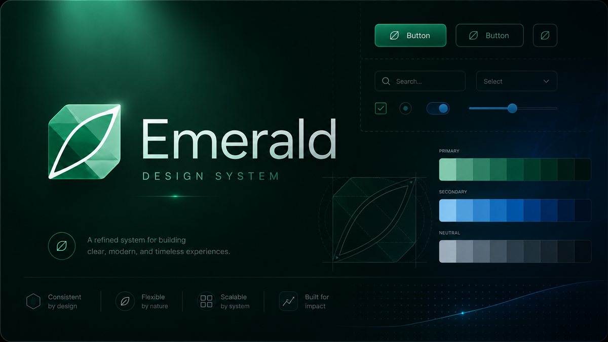
Emerald is a complete visual language for Vuetify0: tokens, icons, components, and layout patterns shaped around calm, tactile interfaces. This Figma library is the design-side mirror of @paper/emerald — the same color scales, spacing rhythm, typography roles, and component anatomy you ship in code.
Design in Figma. Build in Vue. Nothing gets lost in translation.
What Makes This Kit Different
Emerald does not restyle someone else's components. It brings its own vocabulary — EmButton, EmSelect, EmKanban, and the rest — while staying faithful to the compound structure underneath Vuetify0. When you hand off a screen, developers are not guessing: every frame maps to a documented component and a CSS token they already have installed.
Design-to-code parity
* Tokens in Figma export from the same source as the npm package (colors.ts, design-system.ts)
* Light and dark palettes switch with a single theme attribute — emerald-light / emerald-dark
* Icon roles (calendar, mail, finance) resolve the same way in design and in EmIcon
* Compound parts (EmDialogTitle, EmSelectItem, EmCalendarHeader) match the code API
Aesthetic direction
* Cool mineral tones and jade-inspired accents
* Soft contrast, fog-like surfaces, controlled vibrancy
* Elevation with meaning — shadows only where surfaces float
* Motion and state feedback designed to feel tactile without visual noise
Inside the Kit
Token Foundations
Every visual decision lives under the --emerald-* namespace — organized so designers and developers speak the same language.
Family |
Examples |
|---|---|
Color |
|
Spacing |
|
Radius & stroke |
|
Typography |
|
Icon, shadow, motion |
|
Colors ship as hex values and as RGB channels for translucent overlays — the same dual format the runtime CSS emits.
Figma variables are wired to these names so a token change in design propagates cleanly to implementation.
Dual Themes
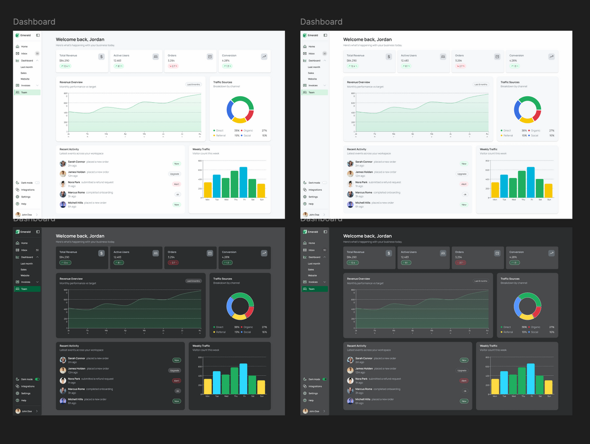
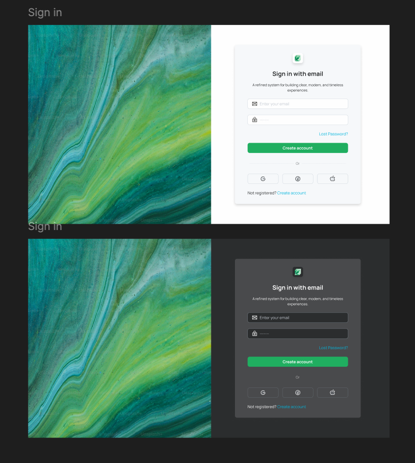
Light is the default environment. Dark is a deliberate companion — not a simple inversion. Toggle between emerald-light and emerald-dark to preview both modes without duplicating frames.
Icon System
48 glyphs, 72 role names. You pick by intent — envelope, not a filename. Aliases like mail → envelope and finance → card behave exactly as they do in code. Decorative by default; labelled when accessibility requires it.
Component Library
Every shipped Em* component is represented with its variants, states, and compound parts:
Category |
Components |
|---|---|
Actions |
EmButton |
Forms |
EmTextField, EmTextarea, EmCheckbox, EmRadio, EmSwitch, EmSelect, EmSlider |
Feedback |
EmAlert, EmBadge, EmProgress, EmSpinner, EmSnackbar, EmTooltip |
Navigation |
EmTabs, EmBreadcrumbs, EmPagination, EmStep |
Surfaces |
EmCard, EmDialog, EmPopover, EmDivider, EmExpansionPanel |
Data display |
EmList, EmAvatar, EmTag, EmCalendar, EmKanban |
System |
EmIcon |
Each component covers the interaction states that matter in production: default, hover, focus, active, disabled, and error — sized and spaced against the Emerald scale, not borrowed from another system.
Dashboard Patterns
Beyond atoms and molecules, the kit includes layout scaffolding from the MIT showcase app — calendar views, kanban boards, and dashboard shells — so you can compose full product screens without rebuilding structure from scratch.
Who This Is For
* Product designers building dashboards, SaaS tools, or productivity apps who want a cohesive system without starting from a blank canvas
* Design–dev teams on Vuetify0 who need Figma frames that map 1:1 to @paper/emerald
* Agencies delivering client work where handoff clarity saves rework
* Teams exploring beyond Material Design while keeping accessibility and behavior battle-tested through Vuetify0 underneath
What You Get
* Full component set — every documented Em* family with variants and compound parts
* Token library — color, spacing, radius, stroke, type, icon, shadow, and motion variables aligned with the npm package
* Light + dark themes — switchable via Figma variables / theme modes
* Role-based icon set — the complete Emerald glyph map with aliases
* Dashboard building blocks — calendar, kanban, and layout patterns from the showcase app
* Free updates — the kit evolves with Emerald as the design system matures
Open Code, Premium Design File
The Emerald design system — components, tokens, and the dashboard app — is MIT licensed and ships as @paper/emerald.
This Figma UI Kit is the companion design asset: the fastest path from exploration to implementation when you want pixels and props to stay in sync.
Before You Buy
This kit covers Emerald core components. It is the design counterpart of the open-source system documented at 0.vuetifyjs.com/systems/emerald.
Looking for Material Design and Vuetify 4 component parity? See the Official Vuetify 4 UI Kit for Figma.
Start Designing with Emerald
Open the file, set your theme, drop an EmButton — and know the Vue component waiting on the other side already matches.
Questions or feedback? Reach us at store@vuetifyjs.com or join the Vuetify Discord community.