Official Vuetify 4 UI Kit for Figma v4.0 — Pro Edition
Official Vuetify 4 UI Kit for Figma v4.0 — Pro Edition


Vuetify UI Kit 4.0 – The Next Level of Design Systems ✨
⚡ Important Update:
By downloading this product, you will receive both included versions:
- UI Kit for Figma — Version 3 + the new Version 4
This ensures compatibility with existing projects while giving you immediate access to the latest updates, improvements, and new components included in V4.
Note: The UI Kit includes only core components.
If you’re looking for Snips as well, Vuetify Snips for Figma includes both the UI Kit and all Snips blocks together.
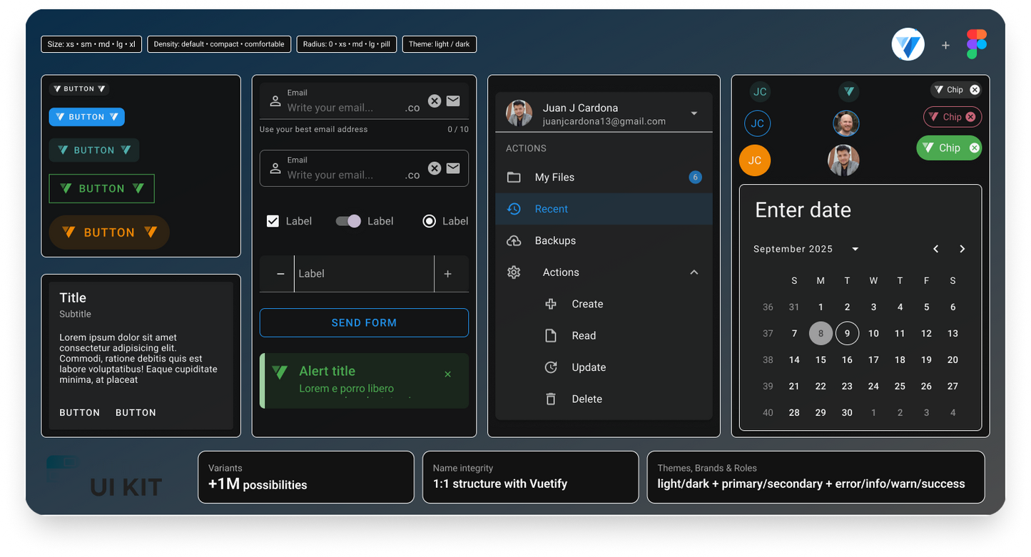
Ready to supercharge your design workflow? The brand-new Vuetify UI Kit 4.0 is here — rebuilt, expanded, and more customizable than ever. Fully optimized for Figma and based on Material Design - Vuetify, this update unlocks professional-grade flexibility for apps, dashboards, and modern websites. 🚀
What’s New in 4.0:
🧩 All Components & Variants: Every component, every variant, fully supported and compatibility with Vuetify.
Typography
Elevations
🎛️ Smart Customization: colors, scalable options, and effortless adaptability.
🎨 Full MD Color Foundations: All Material Design colors at your fingertips. and following guidelines that are more in line with Material Design
🌗 Dual Themes: Light and Dark modes, instantly switchable.
🌈 Extended Color System: Default, Primary, Secondary, Custom, Error, Warning, Info, Success.
⚡ Rich States Support: Enabled, Disabled, Active/Focus, Hover.
📏 Flexible Sizes & Density: From X/Small to X/Large, plus Default, Comfortable, and Compact density.
⬜ Advanced Border Options: Control color, width (xs–xl), opacity (0–100) and radius (square, xs–xl, pill, circle).
🛡️ Error States: Full error handling across components.

Why Upgrade to 4.0? ❤️
- Ultimate Flexibility: More colors, more sizes, more states—tailor every detail.
- Future-Ready: Perfect for modern apps, e-commerce stores, and high-impact dashboards.
- Streamlined Workflow: Organized with Material Design logic, keeping your design system clean and powerful.
What’s Inside:
- 150+ Essential Components: From buttons, forms, and tables to complex elements like carousels, steppers, and timelines.
-
All the Variants You’ll need: Supports multiple variants (
flat,elevated,outlined, and more) for versatile designs. - Smart Variables & Themes: Enjoy built-in themes (light and dark) with color variables for primary, secondary, and custom palettes.
-
Scalable Customization: With densities, states, and sizes (
x-smalltox-large), create perfectly tailored UI elements for any project.
👉 Start creating with Vuetify UI Kit 4.0 and design faster, smarter, and bolder.
👉 Reach us on Discord to share your questions, ideas, or feedback.
Juan J Cardona
Couldn't load pickup availability
Vuetify UI Kit 4.0 – The Next Level of Design Systems ✨
⚡ Important Update:
By downloading this product, you will receive both included versions:
- UI Kit for Figma — Version 3 + the new Version 4
This ensures compatibility with existing projects while giving you immediate access to the latest updates, improvements, and new components included in V4.
Note: The UI Kit includes only core components.
If you’re looking for Snips as well, Vuetify Snips for Figma includes both the UI Kit and all Snips blocks together.
Ready to supercharge your design workflow? The brand-new Vuetify UI Kit 4.0 is here — rebuilt, expanded, and more customizable than ever. Fully optimized for Figma and based on Material Design - Vuetify, this update unlocks professional-grade flexibility for apps, dashboards, and modern websites. 🚀
What’s New in 4.0:
🧩 All Components & Variants: Every component, every variant, fully supported and compatibility with Vuetify.
Typography
Elevations
🎛️ Smart Customization: colors, scalable options, and effortless adaptability.
🎨 Full MD Color Foundations: All Material Design colors at your fingertips. and following guidelines that are more in line with Material Design
🌗 Dual Themes: Light and Dark modes, instantly switchable.
🌈 Extended Color System: Default, Primary, Secondary, Custom, Error, Warning, Info, Success.
⚡ Rich States Support: Enabled, Disabled, Active/Focus, Hover.
📏 Flexible Sizes & Density: From X/Small to X/Large, plus Default, Comfortable, and Compact density.
⬜ Advanced Border Options: Control color, width (xs–xl), opacity (0–100) and radius (square, xs–xl, pill, circle).
🛡️ Error States: Full error handling across components.
Why Upgrade to 4.0? ❤️
- Ultimate Flexibility: More colors, more sizes, more states—tailor every detail.
- Future-Ready: Perfect for modern apps, e-commerce stores, and high-impact dashboards.
- Streamlined Workflow: Organized with Material Design logic, keeping your design system clean and powerful.
What’s Inside:
- 150+ Essential Components: From buttons, forms, and tables to complex elements like carousels, steppers, and timelines.
-
All the Variants You’ll need: Supports multiple variants (
flat,elevated,outlined, and more) for versatile designs. - Smart Variables & Themes: Enjoy built-in themes (light and dark) with color variables for primary, secondary, and custom palettes.
-
Scalable Customization: With densities, states, and sizes (
x-smalltox-large), create perfectly tailored UI elements for any project.
👉 Start creating with Vuetify UI Kit 4.0 and design faster, smarter, and bolder.
👉 Reach us on Discord to share your questions, ideas, or feedback.